The rise of editorial dark mode — why bold typography is winning in 2026
Minimal gradients are out. Massive type, cinematic contrast and confident brand voice are the new default for premium portfolios and SaaS.
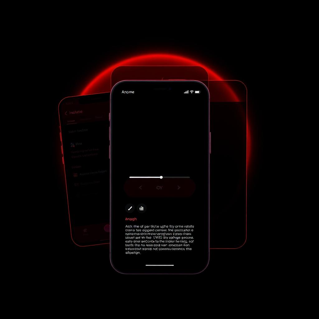
The soft purple gradient era is over. What replaced it is closer to print: near-black backgrounds, one saturated accent, and typography large enough to carry the page on its own.
Contrast is a hierarchy tool
In a dark palette you have far more range to work with. Use it deliberately — one accent colour for actions and emphasis, muted greys for supporting text, and pure white reserved for the things that matter most. Three tones of text is usually enough.
Type does the layout
Oversized display type creates structure without decoration. Set headlines at fluid sizes, tighten line height below one, and let generous whitespace do the rest. Fewer boxes, fewer cards, fewer borders.
Motion with restraint
Reveal-on-scroll and subtle parallax read as premium. Anything that delays content or hijacks scrolling reads as amateur. Respect reduced-motion preferences.
Accessibility is not optional
Dark themes fail contrast checks more often than light ones. Verify body text against WCAG AA, avoid pure-black on pure-white flashes between routes, and test on an actual phone in daylight.
Need this done on your site?
I work with founders and small teams on performance marketing, SEO and conversion-focused design.
Start a project